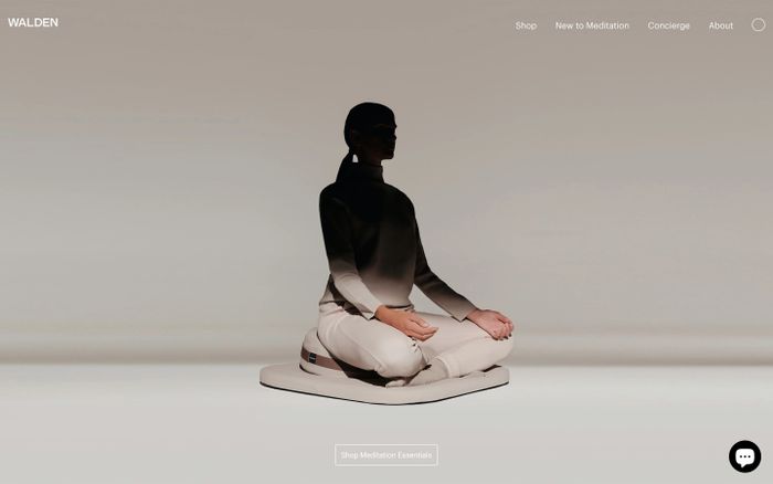
What this palette style is
A warm palette leans toward reds, oranges, yellows and warm neutrals rather than cool blues and icy grays. Even when the palette is restrained, it tends to feel more human and approachable.
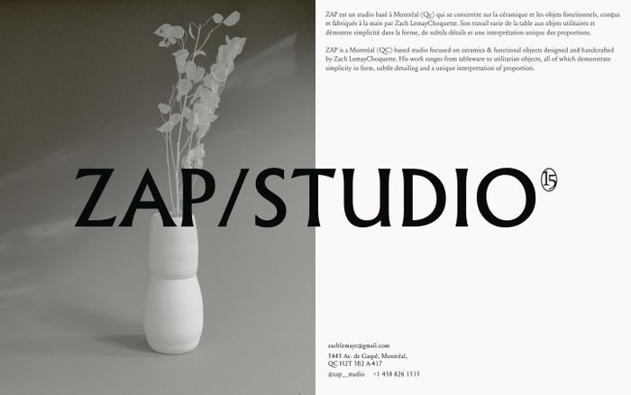
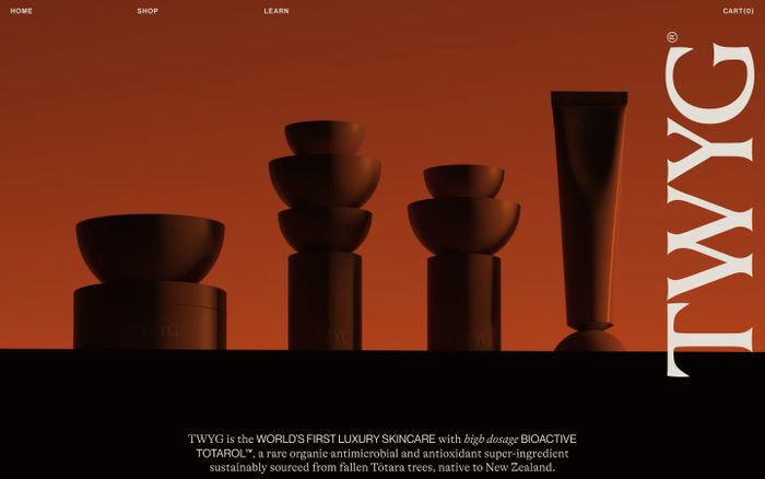
Warm color palettes are built to feel welcoming. They often use cream, clay, tan, orange, gold and red-based accents to create a softer kind of energy.
A warm palette leans toward reds, oranges, yellows and warm neutrals rather than cool blues and icy grays. Even when the palette is restrained, it tends to feel more human and approachable.
These palettes are pulled from published websites in MaxiBestOf and grouped by the warm tag so you can compare real-world combinations instead of generic swatches.