What this palette style is
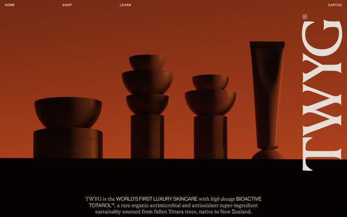
Orange sits between red and yellow, which gives it warmth and energy at the same time. It is often strongest when used as a lead accent rather than spread evenly across every interface surface.
Orange color palettes feel lively and approachable, especially when orange is balanced with darker neutrals, cream backgrounds or softer complementary tones.
Browse related palette styles
Orange sits between red and yellow, which gives it warmth and energy at the same time. It is often strongest when used as a lead accent rather than spread evenly across every interface surface.
These palettes are pulled from published websites in MaxiBestOf and grouped by the orange tag so you can compare real-world combinations instead of generic swatches.