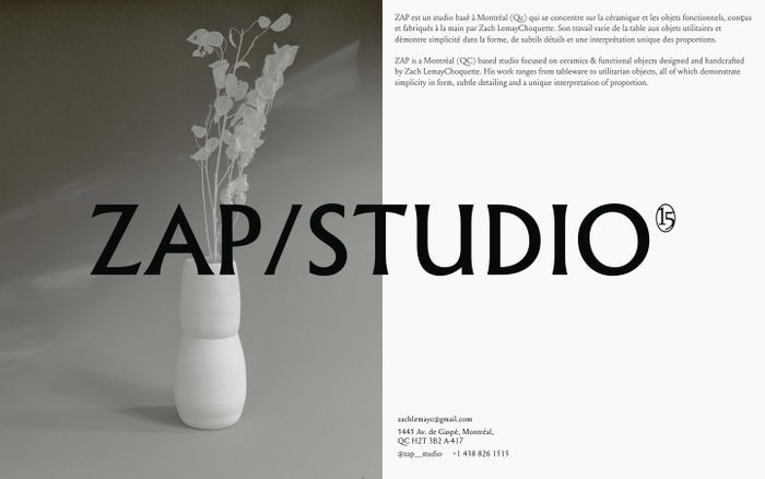
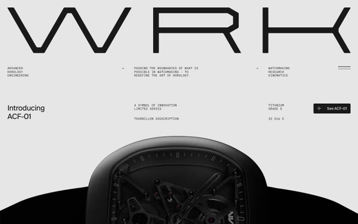
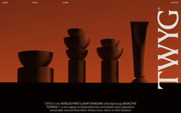
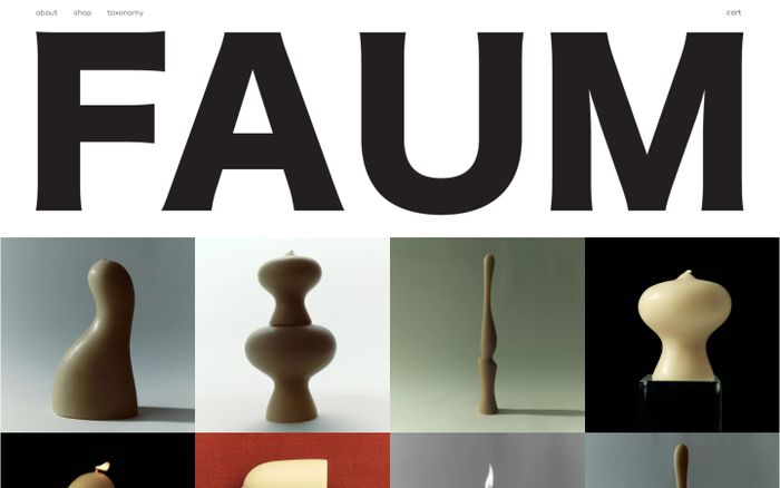
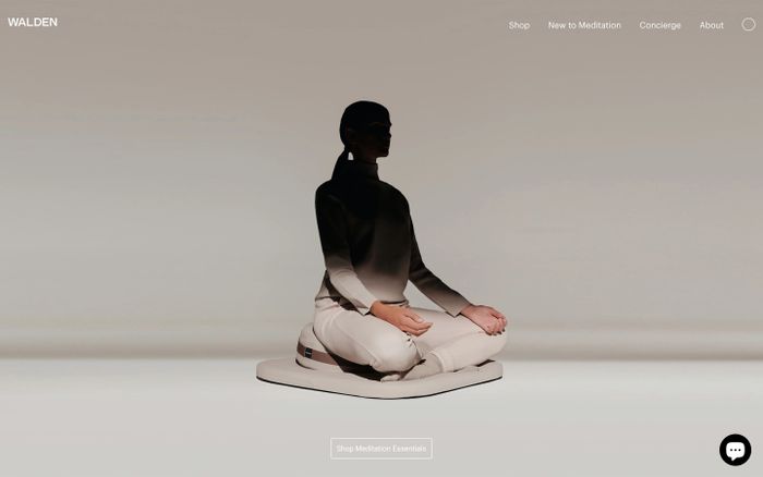
What this palette style is
Instead of relying on candy-bright pastel colors, neutral pastel systems stay quieter. The result feels more refined and easier to use across larger layouts, product pages and brand surfaces.
Neutral pastel palettes soften the usual pastel look by mixing pale accents with grounded creams, warm grays and low-contrast neutrals.
Instead of relying on candy-bright pastel colors, neutral pastel systems stay quieter. The result feels more refined and easier to use across larger layouts, product pages and brand surfaces.
These palettes are pulled from published websites in MaxiBestOf and grouped by the neutral pastel tag so you can compare real-world combinations instead of generic swatches.